Tuesday, August 26, 2008

Shawn Michaels HBK

I am not sure what I was thinking when I did this LO with Shawn Michaels, the Heartbreak Kid, The Showstopper, Mr Wrestlemania etc. In retrospect I probably wasn´t. It was the green from HBK´s jacket that I wanted as a base but somehow I chose something in a completely different tone (even thought its closer in real). Breaking hearts, yes, and the text from the bottom photo, yes, and also the ribbon and the name that reminded a bit of HBK´s tattoo. All good ideas really but when put together, no! I see now what I should have done. A different green paper and a much larger broken heart would have done it. Of course I would have to place the other stuff differently, and probably loose the top photo but I actually think that would work. Lots of ideas for one LO is fine but if you cant get the ideas to work together, well, then one should contenplate on doing something else and not as I just go bang on and hope for the best! Papers are nice though, Basic Grey, Crate and something I cant remember the name of. One of these days I will just have to make a new one.


Monday, August 25, 2008

A-Train

There are two ways for me to find inspiration from the photographs I use in my layouts. The first is of course the normal, colours, shapes and the actual motif. The other way is what the persons in the photographs represent. Take this one for instance. The giant person who on the photo is squeezing the daylights out of my son goes under the name of A-Train, or at least he did when he was in the WWE. So instead of going with the white & black colours in the photograph I went more for the character and the name when deciding on how to decorate this one. The A represents his name of course but its also a tunnel where the speeding train comes rushing out. To create a feeling of speed I cut out my own letters and had them connected to the A/tunnel. The tracks are merely there as a decoration and to emphasize the "train"-theme and also to get a balance in the LO with the tracks laid out in a similar fashion as the A. I am not trying to sound like an artist or anything like that, God knows I have created some really useless LO`s, I am merely trying to explain how I think when I "create". Everything on this LO is also originally made and cut out by me and yes, its Basic Grey!


Below you see a close-up of the letters and the track. I used 3D-cushions for the letters to enhance the speed-effect and gluedots for the rails on the track to make them look more real.
And to finish things off, A-Train left my son unhurt even though I wished he had squeezed a bit more sense into him!

Sunday, August 24, 2008

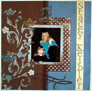
Stacey Keibler

This LO is with Stacey Keibler, former WWE-Diva, Dancing with the stars-star and actress, and of course my darling daughter. This one I really enjoyed to do since the colours in the photo were so thankfull to work with. Its usually a lot of dark photos of big wrestlers wearing dark clothes so with this one I could go "all in" to our paper stock. I used papers from Basic Grey of course but also Bohemé and different CS. I really enjoy cutting out swirls and shapes, it takes time but its well worth it in the end. Also laying some of the swirls over the photo and the photo mat creates a very nice effect, or at least I think so. Some bling, some flowers and some stickles as well and one of my better LO´s was ready. The only thing I was not entirely happy with is the namestrap. The colours should have been the other way around to match the photo with Stacys strap and her blonde hair, but still, this is one of the few I am really happy with.


Gregory Helms

Less is more is a saying and on this LO I quite agree. Notmuch has been done on this one which has a paper from My Minds Eye as a base. I then used a tool (you will have to excuse me, I can mention about a thousand wrestling moves like that but remembering what the scrapbooking-stuff is called, totally blank!) from Fiskars to dry emboss the corners of the paper and dabbed some goldcolour on it. The photo of Gregory Helms I cut out by hand and then took some CS to extend the cape and use it as a photo mat. The hardest part of this LO was to talk my wife into writing the name in calligraphy. It was well worth it though. She writes beautifully and after I heat-embossed the name it was more than enough with embellishments, less is more sometimes!


Friday, August 15, 2008

Randy Orton times two

WWEs badboy number one is Randy Orton. There are many stories about him getting involved in troublein real life. We have met Randy twice and we can only say good things about him, he is truly a nice person who has really given us time and just because of that he is one of our favorite WWE Superstars, heel or not! I did want to do something special with the photos and I thought I had the perfect paper when I found this one from Creative Imaginations. The tribal pattern matched Randys tattoos perfectly and the colours where just right for the top photo. I just added some homemade letters to match the pattern and a Basic Grey paper as a photo mat that blended into the layout. I was more than happy but then I looked carefully at it. Not good at all! Its just not enough and that is a problem I do find quite often when working with this beautiful designer papers. They are so nice you dont want to change them and just adding photos on them does not feel creative at all. Anyways, I made up fo my lack of creativity on the next Orton LO.


This one I did not do much on either but I did do something original, and that is really what scrapbooking is about to me, trying new ways and trying things that you dont see a lot. Here I used a Basic Grey Dasher paper as background and it almost looks like sparks from the firework on the bottom photo and another Basic Grey paper that looked just like Randys shirt. I cut some strips out and had it run "through" Randy and added some drops for effect. The title I heatembossed on a title-mat that was similar to the Wrestlemania-sign on top. Its not really much more than the top LO but its something of my own and therefore something I am much more pleased with. And it does really look a lot better when seeing it for real.


Thursday, August 14, 2008

Funaki

My Funaki LO took some time to make since it was a lot of cutting involved but it was still an easy LO to make. Sometimes, and this does not happen very often, I do get bright ideas and using the colours and Funakis japanese heritage as inspiration for the LO was one of them. One of the cheaper LO´s I have made as well since I only used two sheets of cardstock and some scrap-parts for the letters that are "You are not the boss of me". One thing I did forget was to chalk but since this was in the beginning I have forgiven myself. However I will do something similar in the future with another wrestler of japanese heritage and when I do the chalk will be right there with me. Still, I quite like this one!


Tuesday, August 12, 2008

Nunzio

Simplicity is often the word when I try to do something, and that also applies to my scrapbooking. The idea for this LO was easy since Nunzio is of italian heritage and with Basic Grey papers I did not really have to work so hard on this one. Some Crate paper for the photo mats and a couple of copper brads and I was ready. Probably one of the easiest and quickest LO´s I have ever made but still one of my favorites.


Ric Flair

Trying to make Ric Flair justice on a LO is difficult, if not impossible, but I am still quite happy with this one. My trusty knife came in handy here when I cut out the silouette that I drew and I started getting the feel of using the elements in the photo. The spotlightbeam is definately one of my highlights. I also discovered that you dont always have to use Basic Grey, there is loads of other designer paper out there (My Minds Eye in this case), and that a catchy title sometimes can make up for for lack of experience when scrapbooking. A little dryembossing and some gold on that for some extra Flair, well, It could have been worse.


Monday, August 11, 2008

Triple H

Learning new techniques for scrapbooking is fun and its even better when the result of ones efforts come out this good! I had never dry-embossed before but seeing what my wife could do I just had to try it. I had this picture from one of the WWE shows that me and my kids have attented of the then world champion HHH standing on the ropes and displaying the world heavyweightbelt and I thought that thats just what I wanted to create. Adding the photo of the champ with my kids and then using a gold CS that I dry-embossed plus putting on some red "stones" that you have on the original belt I was more than happy with the end result. I do have to use that technique more because you can make a lot from nothing. The red rope that I incorporated into the bottom picture might be a bit to much but it does look better in real. The title was also a new technique my wife taught me, heat-embossing, and thats also really fun and the result is often stunning. The title is written and then heat-embossed with a shiny black powder and once again, I have to do that more often.


Victoria

If you get into the habit of making LO´s with pictures of wrestlers that weigh in at ridiculosly high weights, and all muscle, you dont really get to use the fantastic "girlie"-papers that are pink! Even though I consider myself a mans man (says the guy who scrapbooks and writes in his blog) the papers are just adorable, and there is a lot of them, so they just have to be used. Thankfully enough the WWE also provides female wrestlers, or divas as they like to call them, and my kids have also taken their pictures with quite a few of them so I get to shop a little pink without beeing ashamed. On this LO with the very charming and nice wrestler Victoria I started cutting out flowers and patterns and tried to incorporate them with the stunning background paper that goes so well with Victorias clothes (thank you for chosing them that day!). A little bling, some "real" flowers, Basic Grey of course and a lot of pink later I was more than happy with this one and it even looks better in real life!

Edge

Scrapbooking is so much more than I thought it was in the beginning. There are all the little things you can add and all the different techniques you can use. From not knowing anything I have at least taken a few fumbling steps forward and its mostly thanks to my wife who seems to master all the techniques. Seeing the paper that I chose for this LO with Edge and my kids she suggested that I should use sandpaper to make the photo look a bit more older and used. At firts I thought she was a bit crazy but since I know how good she is I trusted her and started sandpapering away. I like the result and it gives a bit more edge to this Edge-LO. I have since then used the sandpaper on other projects, with mixed results, but it is a very handy technique indeed and always useful with the Basic Grey collection that I do use a lot. At this point I still used a lot of alphabets for the cuttlebug and the Hippie Chick one is very nice. However I have come to the conclusion that its hard to be original using the alphabets so you have to either buy new ones all the time or cut out your own, and that is what I try to do mostly know even if you will see a lot of diecuts in the LO´s to come before I show my newer stuff.


Chuck Palumbo

Here is an LO that I am quite happy with. I have used the colours from the photo, Palumbos shirt and the ceiling, the shapes in the photo (his sunglasses) and also what he is all about, motorcycles. Except beeing a WWE Superstar and wrestler Chuck also builds custom motorcycles has incorporated that into his wrestling gimmick. I incorporated it into the LO by making the title as a Harley Davidson logo. Shapes, colours, thoughts and designer papers (Crate, Basic Grey) working together for once! I felt extremly proud when it was done and one could say I found my style here even though I do things that are entirely different on some occasions.


Batista

This one was also made in the beginning of my scrapbooking "career" and you can at least see that I have started with cutting out my own shapes. However my choice of colours are not that great, I was more fascinated with all the fantastic papers than thinking of coordinating them and making everything into an LO that holds together. Here its just a few nice looking papers and all randomly placed on the LO even though I had a thought with the stars and the Batista logo. Once again, you learn a lot. Basic Grey might be fabolous papers but you need a bit more than that to create something you are happy with.


Eugene

One of my early creations and after my Kurt Angle LO this just sunk to the bottom quicker than the Titanic. The only thing I am happy with on this one is the photo and tag mat. The paper (Crate) is nearly identical with the shirt Eugene is wearing on the photo. In retrospect I cpould have done so much more with it but we all have to learn from our mistakes. On this one I just thought that everything would fit in and since I hardly did not use anything except the Carolees paper for background there was nothing to fit!


Kurt Angle

This is the first scrapbooking layout I ever made and it's a picture of my son and the wrestler and Olympic gold medalist Kurt Angle. For this LO I only used cardstock, two different types of cuttlebug star diecuts and diecut letters. I had yet to discover that you actually could create your own embellishments even though the red "star stripes" are my own. I was however, quite proud of my very first layout.