Wednesday, December 31, 2008

Cryme Tyme, Shad Gaspar

Here is my last LO for 2008 and it features Shad Gaspar of the tagteam Cryme Tyme. Shad was a huge man but he was as kind as he was big! We met him twice, the first time we did not have a camera or anything with us, we were just standing looking stupid in the hotel-lobby (and we are really great at that!). We did not know that the wrestlers were staying at our hotel so we got quite a surprice when Shad came walking there. He saw us standing there in our wrestling T-shirts and stopped, stretched out his hand and shook ours and chatted a bit. Its really something special when the wrestlers come to us by free will (who in their right mind would want to do that ?). We also met him later during the day and then we were ready with the camera and the Cryme Tyme-sign.

The LO is made on a paper from My Minds Eye and I have sponged out some Black acrylic paint on the sides. The Cryme Tyme-text I have drawn myself (I found the fonts in our computer and copied them) and then cut them out in a Basic Grey paper. Then I cut out the black and white shades in CS. When my wife saw the text she said that she could have done that on her new machine, a Bosskut Gazelle. If I only had known! Her Gazelle got to work a bit for me after that and it cut out the bus (I chose to have a schoolbus since Cryme Tyme has one in their Internetshow Word up) which I customized in the Funtime software and then I also added a few bits and pieces afterwards. The text "Shad Gaspar" I printed out on a piece of yellow CS and attached to the bus which is made out of 4 kinds of CS. Some 3D-cushions, glue-dots and a lot of chalk later I was nearly ready. I just had to use my own private stamp which I have ordered from Norway so it left my brand in the corner of the LO. I dont know if it really fits there but I still giggled when I placed it there. Sometimes I am a bit childish.


The Cryme Tyme Shad Gaspar layout, I am quite happy with it.


A close up of the wheel, just for the fun of it!


And a close up of my stamp, now thats really fun!

Saturday, November 22, 2008

Rey Mysterio

Rey Mysterio is one of the smallest wrestlers, if not the smallest, in the WWE but he is also one of their biggest stars. We have met Rey on several occasions but for different reasons photographs have never been taken. This year when we met him it we nearly missed out again since I was not quick enough with the camera when my son got an autograph from Rey. Luckily enough we met Rey the day after as well and this time I was ready and finally I got a picture for a Rey Mysterio LO.

I have used a lot of paper for this one. First a Basic Grey for the background which I stamped (Rhona Farrer) up with 619, Reys finishing move, then a lightblue Crate for the mask. A white CS and a shiny black CS for the details on the mask and then a black CS for the title and a grey CS for the background for the letters. A Crate-paper for the skin which I drew a little on and the eyes are drawn on white CS (I tried to cut out eyes in paper but I never got it to look good). A piece of bling on the cross and some stickles gave the mask a nice lift. The letters I have drawn myself (as the mask), cut out templates with a knife and then drawn them again on CS and cut again. It really took some time and I did not succeed on the first time with a few of them. But this time I did not give up and in the end it was worth it. The grey background made the letters look nicer and a little Glossy Accent on the letters as well created a nice effect. And finally my Mysterio-LO was finished. I am happy with it even though I probably should have chosen another background colour. But still, I think Rey would like this one just as much as he liked the sign that my son is holding on the photo, that one drawn by me as well!


The LO I have been waiting to create!


Stickles and bling, always a winner!


Glossy Accent, an invention just as important as the wheel!

Saturday, November 1, 2008

Santino Marella, part two

Here is my second LO from our meeting with the WWE Intercontinental Champion, or in his case, Campione, Santino Marella. I did continue my Italy-theme, or at least I tried! After I was finished with it, I photographed it and left it on the table. Walking over to the other side of the table and seeing the LO upside down I discovered my blunder, I had put the red to the left and the green to the right. Completely wrong if you are trying to do the Italian flag! So another LO ruined by a stupid mistake. Apparently though I have grown as a person since I did not do what I usually do when I fail, curse, tear everything apart and throw a temper tantrum that would make any three year old so envious they would never scream again. I do confess that I did curse a little (in my world it was a little) and mope a bit but this time I solved the problem, or at least saved the LO a bit by adding four small Italian flags so it looks kind of color coordinated. Anyways, enough of the story and here is the important part, how I did:

First I chose my papers, red, "white" (not really white, more of a pale sand colour, but still) and green (in that order!) from the Crate collections Brunch and Crush. This was for the flag colours and I used Crate-paper to get some more life into the LO since CS is kind of stale. Then I also took another Crate-paper for the text. A light blue one to match the photo of Santino and me which has a blue tone. I then proceeded to draw Italy and cut it out by hand and that took some time. Many where the times that I wished Santino was from Colorado or any other square state in the US! But Italy it was and in the end it came out nicely. I used an overlay from Hambley as a photo mat under (makes total sence if you are me) the photos and Italy. The letters are Quickkutz Washington and I thought they matched the Italy-theme very well. I also glaced them (first time if you dont count baking) with Glossy accents from Tim Holtz Inkssentials. And you already know why I added the small Italian flags. All in all I think it was a good idea and it would have been real good if I could have remembered how the Italian flag looked before I put everything together.


The whole LO ...


and a close up of my first attempt at glacing.

Monday, October 27, 2008

Santino Marella, part one

I still have quite a few photos with my kids and wrestlers to be scrapped (+quite a lot of old LO´s to be posted) but I have not really found any inspiration for the photos I have left. Mostly its wrestlers/Divas who have left the WWE, or even passed away! So what does one do? I either start up with other projects, or fix new wrestlingphotos. I decided on the latter, or at least that was the plan when me and my son once again went to a wrestling-event in Barcelona Spain. This time we saw two shows and luckily enough for my scrapbooking career we met a bunch of the Superstars and one Diva. Now I have quite a few hours with my scissors and knifes in front of me and thats quite a comforting feeling. Here is the first LO I made from this years wrestlers, Santino Marella!

For this one I have only used cardstock because I felt it was just the stuff for my LO-idea. I got the idea from one of Santinos T-shirts, I drew it, changed a bit here and there, cut out templates from my drawing, used the templates on CS and then cut out the different shapes. A little chalk, some 3d-cushions on the letters (that were a bit difficult to cut straight, both the Santino- and the Marella-parts) and the photograph and the LO was ready. I am more than happy with this one and currently working on my next Santino-LO, but this time, I will be on the photo as well!

Sunday, September 14, 2008

Cowboy Bob Orton

Its been some time since I made a layout and its not because my motives are running out (I do have a few wrestlers left to scrap) (they wont last forever of course) its just that I have been busy with other things. Me and my son are once again going to a wrestling event so all of the spare time in the scrapbooking-room has been commited to making new signs for us to bring along to the show.

But running out of ideas for the signs I paused and made this LO with Cowboy Bob Orton. I found this paper from Flair Designs (beeing a wrestling fan you cant resist that!) which was called Home on the range and that suited Cowboy Bob perfectly for his background. I then drew up a holster and a belt to fit Cowboy Bob and my kids in, just like a gun. I made a belt buckle from CS and put a photo of Bob and his son, Randy Orton, in, some bullets and some brads to make it look a bit more "real" made the difference. The text I printed on a piece of Basic Grey and then I chalked it to get that burned cowboy feeling (at my age one still remembers the Bonanza-intro). I must say, and of course, I am always full of myself, this one really turned out nice even though its a project between projects!

For this one I used three different CS, 2 x Basic Grey, Crate, Kaiser, Flair Designs, two kinds of brads, chalk and a Rhonna Farrer clear stamp.


Tuesday, September 2, 2008

Rowdy Roddy Piper

When I first started watching the WWE (WWF at that time) is was full of charasmatic characters and persons. One that stood out was Rowdy Roddy Piper and he instantly became one of my favorites. Beeing from Scotland I just could not resist the bagpipes, the kilt and the outspokenness of the rowdy one. Needless to say I was chuffed to bits when we met him and so were my kids. My first thought was to do something in a similar tartan that Piper wears. That was totally impossible! I could not find any papers with a red based tartan, in fact, I could not find any tartans at all! I was just about to scrap the project, by that I mean give up, when my wife brought a paper home with her that nearly did the trick. I used that as a base and then concentrated on getting the inspiration and ideas from Pipers T-shirt instead. The photo mats got the red collar from Pipers T-shirt + the white and that looked rather nice when it was a double photo mat. The Roddy Piper text I drew myself and cut out + used Adirondack Acrylic Paint Dabber to simulate the text on the shirt. The "Rowdy"-part I used templates for and then cut out a yellow shadow to match the other text. The LO is so so, not good not bad, it will just do. Oh, the papers are from Prima Lucid Collection and Daisy D´s + some CS.


Tuesday, August 26, 2008

Shawn Michaels HBK

I am not sure what I was thinking when I did this LO with Shawn Michaels, the Heartbreak Kid, The Showstopper, Mr Wrestlemania etc. In retrospect I probably wasn´t. It was the green from HBK´s jacket that I wanted as a base but somehow I chose something in a completely different tone (even thought its closer in real). Breaking hearts, yes, and the text from the bottom photo, yes, and also the ribbon and the name that reminded a bit of HBK´s tattoo. All good ideas really but when put together, no! I see now what I should have done. A different green paper and a much larger broken heart would have done it. Of course I would have to place the other stuff differently, and probably loose the top photo but I actually think that would work. Lots of ideas for one LO is fine but if you cant get the ideas to work together, well, then one should contenplate on doing something else and not as I just go bang on and hope for the best! Papers are nice though, Basic Grey, Crate and something I cant remember the name of. One of these days I will just have to make a new one.


Monday, August 25, 2008

A-Train

There are two ways for me to find inspiration from the photographs I use in my layouts. The first is of course the normal, colours, shapes and the actual motif. The other way is what the persons in the photographs represent. Take this one for instance. The giant person who on the photo is squeezing the daylights out of my son goes under the name of A-Train, or at least he did when he was in the WWE. So instead of going with the white & black colours in the photograph I went more for the character and the name when deciding on how to decorate this one. The A represents his name of course but its also a tunnel where the speeding train comes rushing out. To create a feeling of speed I cut out my own letters and had them connected to the A/tunnel. The tracks are merely there as a decoration and to emphasize the "train"-theme and also to get a balance in the LO with the tracks laid out in a similar fashion as the A. I am not trying to sound like an artist or anything like that, God knows I have created some really useless LO`s, I am merely trying to explain how I think when I "create". Everything on this LO is also originally made and cut out by me and yes, its Basic Grey!


Below you see a close-up of the letters and the track. I used 3D-cushions for the letters to enhance the speed-effect and gluedots for the rails on the track to make them look more real.
And to finish things off, A-Train left my son unhurt even though I wished he had squeezed a bit more sense into him!

Sunday, August 24, 2008

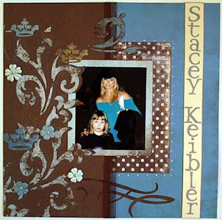
Stacey Keibler

This LO is with Stacey Keibler, former WWE-Diva, Dancing with the stars-star and actress, and of course my darling daughter. This one I really enjoyed to do since the colours in the photo were so thankfull to work with. Its usually a lot of dark photos of big wrestlers wearing dark clothes so with this one I could go "all in" to our paper stock. I used papers from Basic Grey of course but also Bohemé and different CS. I really enjoy cutting out swirls and shapes, it takes time but its well worth it in the end. Also laying some of the swirls over the photo and the photo mat creates a very nice effect, or at least I think so. Some bling, some flowers and some stickles as well and one of my better LO´s was ready. The only thing I was not entirely happy with is the namestrap. The colours should have been the other way around to match the photo with Stacys strap and her blonde hair, but still, this is one of the few I am really happy with.


Gregory Helms

Less is more is a saying and on this LO I quite agree. Notmuch has been done on this one which has a paper from My Minds Eye as a base. I then used a tool (you will have to excuse me, I can mention about a thousand wrestling moves like that but remembering what the scrapbooking-stuff is called, totally blank!) from Fiskars to dry emboss the corners of the paper and dabbed some goldcolour on it. The photo of Gregory Helms I cut out by hand and then took some CS to extend the cape and use it as a photo mat. The hardest part of this LO was to talk my wife into writing the name in calligraphy. It was well worth it though. She writes beautifully and after I heat-embossed the name it was more than enough with embellishments, less is more sometimes!


Friday, August 15, 2008

Randy Orton times two

WWEs badboy number one is Randy Orton. There are many stories about him getting involved in troublein real life. We have met Randy twice and we can only say good things about him, he is truly a nice person who has really given us time and just because of that he is one of our favorite WWE Superstars, heel or not! I did want to do something special with the photos and I thought I had the perfect paper when I found this one from Creative Imaginations. The tribal pattern matched Randys tattoos perfectly and the colours where just right for the top photo. I just added some homemade letters to match the pattern and a Basic Grey paper as a photo mat that blended into the layout. I was more than happy but then I looked carefully at it. Not good at all! Its just not enough and that is a problem I do find quite often when working with this beautiful designer papers. They are so nice you dont want to change them and just adding photos on them does not feel creative at all. Anyways, I made up fo my lack of creativity on the next Orton LO.


This one I did not do much on either but I did do something original, and that is really what scrapbooking is about to me, trying new ways and trying things that you dont see a lot. Here I used a Basic Grey Dasher paper as background and it almost looks like sparks from the firework on the bottom photo and another Basic Grey paper that looked just like Randys shirt. I cut some strips out and had it run "through" Randy and added some drops for effect. The title I heatembossed on a title-mat that was similar to the Wrestlemania-sign on top. Its not really much more than the top LO but its something of my own and therefore something I am much more pleased with. And it does really look a lot better when seeing it for real.


Thursday, August 14, 2008

Funaki

My Funaki LO took some time to make since it was a lot of cutting involved but it was still an easy LO to make. Sometimes, and this does not happen very often, I do get bright ideas and using the colours and Funakis japanese heritage as inspiration for the LO was one of them. One of the cheaper LO´s I have made as well since I only used two sheets of cardstock and some scrap-parts for the letters that are "You are not the boss of me". One thing I did forget was to chalk but since this was in the beginning I have forgiven myself. However I will do something similar in the future with another wrestler of japanese heritage and when I do the chalk will be right there with me. Still, I quite like this one!


Tuesday, August 12, 2008

Nunzio

Simplicity is often the word when I try to do something, and that also applies to my scrapbooking. The idea for this LO was easy since Nunzio is of italian heritage and with Basic Grey papers I did not really have to work so hard on this one. Some Crate paper for the photo mats and a couple of copper brads and I was ready. Probably one of the easiest and quickest LO´s I have ever made but still one of my favorites.


Ric Flair

Trying to make Ric Flair justice on a LO is difficult, if not impossible, but I am still quite happy with this one. My trusty knife came in handy here when I cut out the silouette that I drew and I started getting the feel of using the elements in the photo. The spotlightbeam is definately one of my highlights. I also discovered that you dont always have to use Basic Grey, there is loads of other designer paper out there (My Minds Eye in this case), and that a catchy title sometimes can make up for for lack of experience when scrapbooking. A little dryembossing and some gold on that for some extra Flair, well, It could have been worse.


Monday, August 11, 2008

Triple H

Learning new techniques for scrapbooking is fun and its even better when the result of ones efforts come out this good! I had never dry-embossed before but seeing what my wife could do I just had to try it. I had this picture from one of the WWE shows that me and my kids have attented of the then world champion HHH standing on the ropes and displaying the world heavyweightbelt and I thought that thats just what I wanted to create. Adding the photo of the champ with my kids and then using a gold CS that I dry-embossed plus putting on some red "stones" that you have on the original belt I was more than happy with the end result. I do have to use that technique more because you can make a lot from nothing. The red rope that I incorporated into the bottom picture might be a bit to much but it does look better in real. The title was also a new technique my wife taught me, heat-embossing, and thats also really fun and the result is often stunning. The title is written and then heat-embossed with a shiny black powder and once again, I have to do that more often.


Victoria

If you get into the habit of making LO´s with pictures of wrestlers that weigh in at ridiculosly high weights, and all muscle, you dont really get to use the fantastic "girlie"-papers that are pink! Even though I consider myself a mans man (says the guy who scrapbooks and writes in his blog) the papers are just adorable, and there is a lot of them, so they just have to be used. Thankfully enough the WWE also provides female wrestlers, or divas as they like to call them, and my kids have also taken their pictures with quite a few of them so I get to shop a little pink without beeing ashamed. On this LO with the very charming and nice wrestler Victoria I started cutting out flowers and patterns and tried to incorporate them with the stunning background paper that goes so well with Victorias clothes (thank you for chosing them that day!). A little bling, some "real" flowers, Basic Grey of course and a lot of pink later I was more than happy with this one and it even looks better in real life!

Edge

Scrapbooking is so much more than I thought it was in the beginning. There are all the little things you can add and all the different techniques you can use. From not knowing anything I have at least taken a few fumbling steps forward and its mostly thanks to my wife who seems to master all the techniques. Seeing the paper that I chose for this LO with Edge and my kids she suggested that I should use sandpaper to make the photo look a bit more older and used. At firts I thought she was a bit crazy but since I know how good she is I trusted her and started sandpapering away. I like the result and it gives a bit more edge to this Edge-LO. I have since then used the sandpaper on other projects, with mixed results, but it is a very handy technique indeed and always useful with the Basic Grey collection that I do use a lot. At this point I still used a lot of alphabets for the cuttlebug and the Hippie Chick one is very nice. However I have come to the conclusion that its hard to be original using the alphabets so you have to either buy new ones all the time or cut out your own, and that is what I try to do mostly know even if you will see a lot of diecuts in the LO´s to come before I show my newer stuff.


Chuck Palumbo

Here is an LO that I am quite happy with. I have used the colours from the photo, Palumbos shirt and the ceiling, the shapes in the photo (his sunglasses) and also what he is all about, motorcycles. Except beeing a WWE Superstar and wrestler Chuck also builds custom motorcycles has incorporated that into his wrestling gimmick. I incorporated it into the LO by making the title as a Harley Davidson logo. Shapes, colours, thoughts and designer papers (Crate, Basic Grey) working together for once! I felt extremly proud when it was done and one could say I found my style here even though I do things that are entirely different on some occasions.


Batista

This one was also made in the beginning of my scrapbooking "career" and you can at least see that I have started with cutting out my own shapes. However my choice of colours are not that great, I was more fascinated with all the fantastic papers than thinking of coordinating them and making everything into an LO that holds together. Here its just a few nice looking papers and all randomly placed on the LO even though I had a thought with the stars and the Batista logo. Once again, you learn a lot. Basic Grey might be fabolous papers but you need a bit more than that to create something you are happy with.


Eugene

One of my early creations and after my Kurt Angle LO this just sunk to the bottom quicker than the Titanic. The only thing I am happy with on this one is the photo and tag mat. The paper (Crate) is nearly identical with the shirt Eugene is wearing on the photo. In retrospect I cpould have done so much more with it but we all have to learn from our mistakes. On this one I just thought that everything would fit in and since I hardly did not use anything except the Carolees paper for background there was nothing to fit!


Kurt Angle

This is the first scrapbooking layout I ever made and it's a picture of my son and the wrestler and Olympic gold medalist Kurt Angle. For this LO I only used cardstock, two different types of cuttlebug star diecuts and diecut letters. I had yet to discover that you actually could create your own embellishments even though the red "star stripes" are my own. I was however, quite proud of my very first layout.